Create impact with Monochrome
Mention monochrome and most people think of black and white or greyscale schemes. Yet monochrome simply means of one colour and the choice of colour is entirely up to you. The colours of a monochrome palette share a single hue varying in brightness and saturation – known as tints, tones and shades. If that sounds restrictive, you may be surprised how many different colours can be created.
Monochromatic schemes provide wonderful opportunities in art and design. Using a greater range of contrasting tones, they attract attention, create focus and can provide a strong sense of visual cohesion. The relative absence of hue contrast can be offset by variations in tone and the addition of texture.
Monochrome decorating schemes: In the paint world, shades, tints and tones are created by adding varying amounts of white (tints), black (shades) or grey (tones), as seen in colour cards.
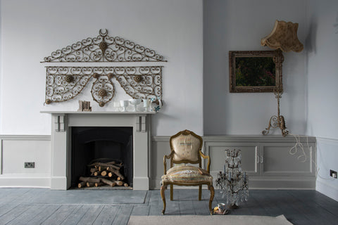
The Scandinavian style of decorating is a great proponent of monochrome schemes. In the Farrow & Ball image (above), greys are layered to create an understated ‘Gustavian’ look that’s calm and relaxed.
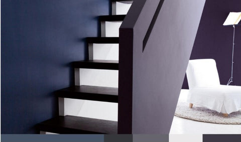
Bolder colours can be balanced by the use of white, grey or other neutrals, as in this Dulux scheme.
Monochrome photography can produce some truly eye-opening effects. Playing with saturation and brightness can create an amazing array of different colours, as this Web Urbanist post wonderfully demonstrates.

Images: Manganite, Mavis_hk and Wards
Monochromatic painting and sculpture have been an important component of avant-garde visual art since the early 20th century. Painters explore a single colour, changing the values across a surface, through texture and nuance.

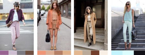
In the world of fashion, monochrome is a perennial favourite. The outfits in this Into Mind post illustrate that monochromes are far from dull. Supplementing with grey, black and white can add variety or balance out bolder colours.
Quilting in monochromes
With fabrics, however, putting together the right combination to make up a palette isn’t quite as easy. Colours may not be available from a single supplier and they can vary in weight, drape and colour intensity.
Here at Oakshott we take a three-fold approach to monochrome palettes.
1. Our Monochrome Packs are carefully curated edits that take the risk out of colour combining. Precut bundles come exquisitely presented in Fat 8ths, Fat Quarters and Half Metres.

2. Our single warp collections - Lakes, Lipari, Ruby Reds, Scandinavia and new Sorbet - comprise eight colourways sharing a common warp thread. This ensures the shades work beautifully together - no need to worry about colour combining. Choose from precut bundles or individual lengths.

3. Curate your personal palettes - our Colourshott colour compendium is a great place to start. It allows you to pick the tints, tones and shades that 'speak' to you, then order lengths to suit your needs. Download the Colourshott Colour Swatch PDF and start palette-building.

Monochromatic colours sit so well together, producing a soothing effect which is easy on the eye. Choosing to design with one colour rather than the entire spectrum can produce surprisingly powerful results.